Do you have consistent SharePoint Sites?
Updated by Brady Stroud [SSW] 1 year ago. See history
123
<introEmbed
body={<>
It's important for all your SharePoint Sites to be as consistent as possible. This helps users' navigation through new pages as they know exactly where to look.
<introYoutube url="https://www.youtube.com/embed/Wf9o6jGhXJI" description="" />
</>}
/>
Following these simple rules makes this really easy:
- Put your preferred navigation in the same place (usually on the left-hand side)
- Keep the headings consistent
- Use icons for each type of link, so users easily know what to expect when clicking on a link (E.g. A Microsoft Word document is going to open a Word document) Aldo, a link to "Home" looks the same on every page.
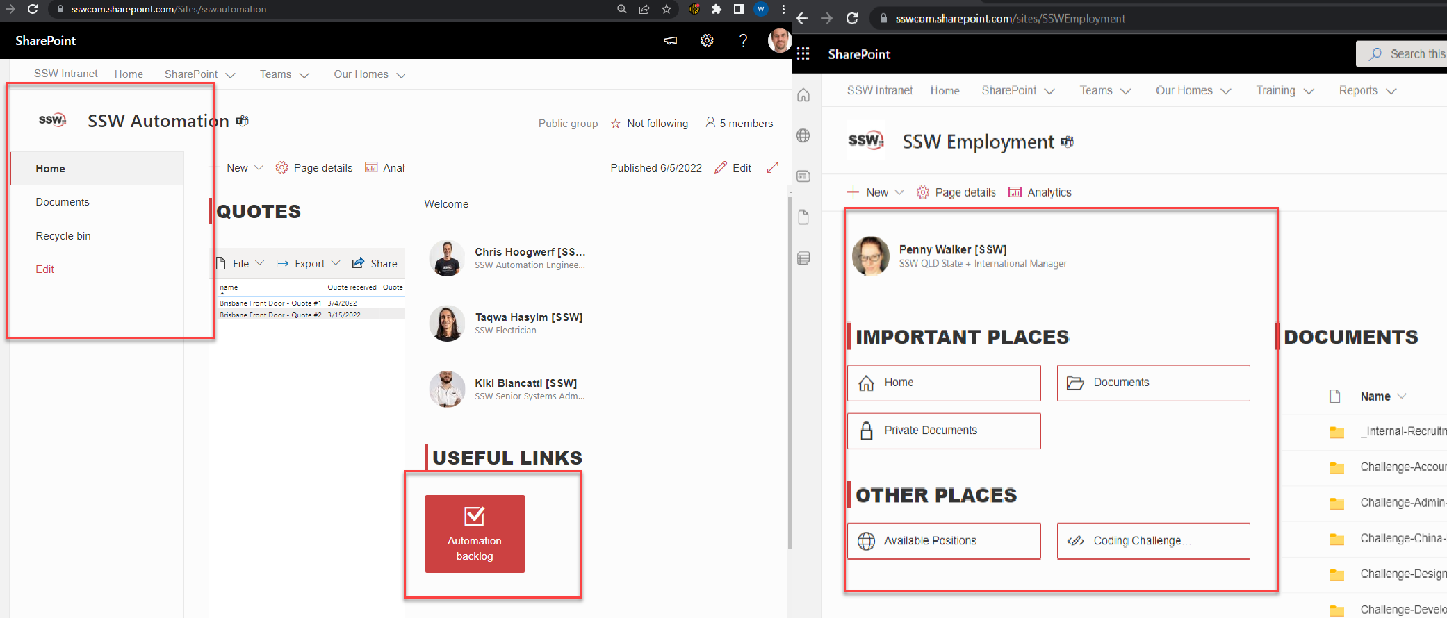
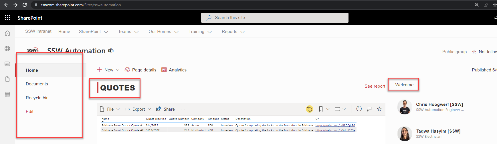
Navigation consistency between pages
❌ Figure: Bad example - The page on the left has totally different navigation to the page on the right
✅ Figure: Good example - Both pages looking consistent - common navigation elements in the same spot
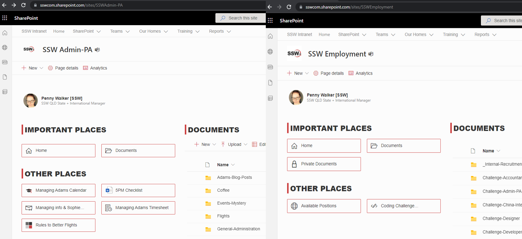
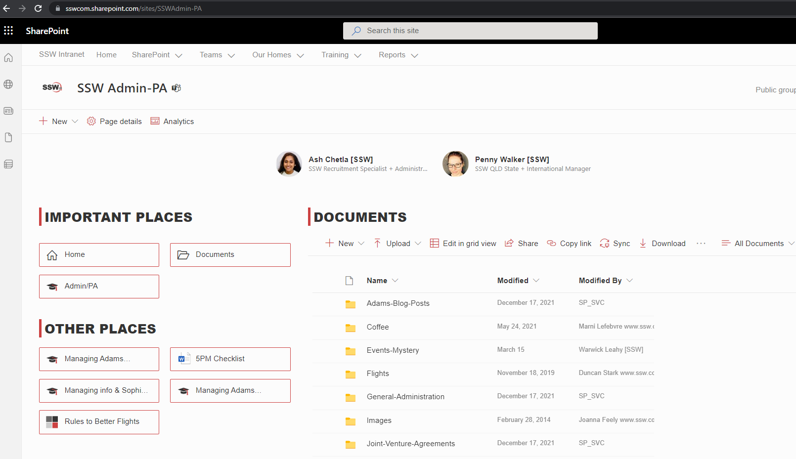
Headings and icons consistency within a page
❌ Figure: Bad example - There are no icons to help users on the left navigation + the headings are the different
✅ Figure: Good example - Icons help users to know what files each link open on the left navigation + the headings are the same
Categories
Acknowledgements


Related rules
Need help?
SSW Consulting has over 30 years of experience developing awesome software solutions.